D | Common Problems

1. Too much text; big blocks of text
Perhaps this class will be more text-averse—but each semester—significant numbers of students just continue to submit presentations with big text dumps. (It happened in Spring 2023!)
If viewers see three block-paragraphs on a slide that is being narrated, it is a major problem, They are trying listen and decode the text, but it is an impossible task. The brain gets overloaded when big blocks—or even one block—of text are displayed as a primary source of visual information.
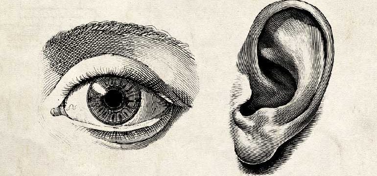
The eye and the ear are fighting it out in the brain and that is not good. Let the eye see “big pictures” and the ear will connect it to the pictures and you will have a better chance of getting the information into long-term memory.
Get some free pictures if you don’t have your own. Link: 23+ Sites to Find Free Images You Would Actually Use for your Marketing.
A professional presentation is not a "text" document. It is okay to sometimes create “document slides” AKA “slideuments” when appropriate, but not in this project. Link: What is a slideument?
2. Hard-to-grasp graphics
Charts and graphic that are not modified for multimedia delivery are not absorbed; they are “eye” pain. Animating charts and graphic for “professional” presentations is time consuming. Even then, they are not as memorable as images. So it is better to go with images. Use free images if you don’t have your own images. If you must include graphics, then here is a link on how to do it right: 10 Good and Bad Examples of Data Visualization
3. Reading text on slides
Some students just can't part with text, so they will limit text to three sentences, but will then read them verbatim. READING SLIDES EXACTLY is not effective! Cliche warning: Two wrongs don't make a right. Your audience reads faster that your speak, so you are creating "eye vs.ear” pain. It is low-pain, but it is still pain. Use keywords and phrases using word art instead, if you simply must have some text on the slide.
The exception to this is animating some primary “graphic” keywords to your narration so that the eye and ear are tightly bound in the brain in a non-sentence fashion. If you don’t have images on that slide, it is still not optimal because it is not as memorable as an image and it is time-consuming. But it can be effective if done well.
I am not talking about closed captioning. That is an assistive technology that keys your text exactly to your speech which is valuable when needed. This works best if it it optional. This is not a requirement for this project, so it not required. The best way to do this is to output a video of your presentation and let a service like YouTube or Vimeo do it for you. Then your viewer can turn it on or off as they wish.
Solution: Treat text as graphics in combination with imagery.
4. Being handcuffed to your template
When the theme becomes the primary driver of your presentation, you might find that it has elements that are actually disruptive once you have your content in place. Go to the master slide and get rid of elements that compete with your content.
5. Thinking the awesome design of your theme is “is visual”
If your theme is very pretty, but it is mostly well-crafted text and “decorated with generic graphics", then it is not visual to your subject matter. Use the theme and the graphics, but don’t be low-image with your particular topic.